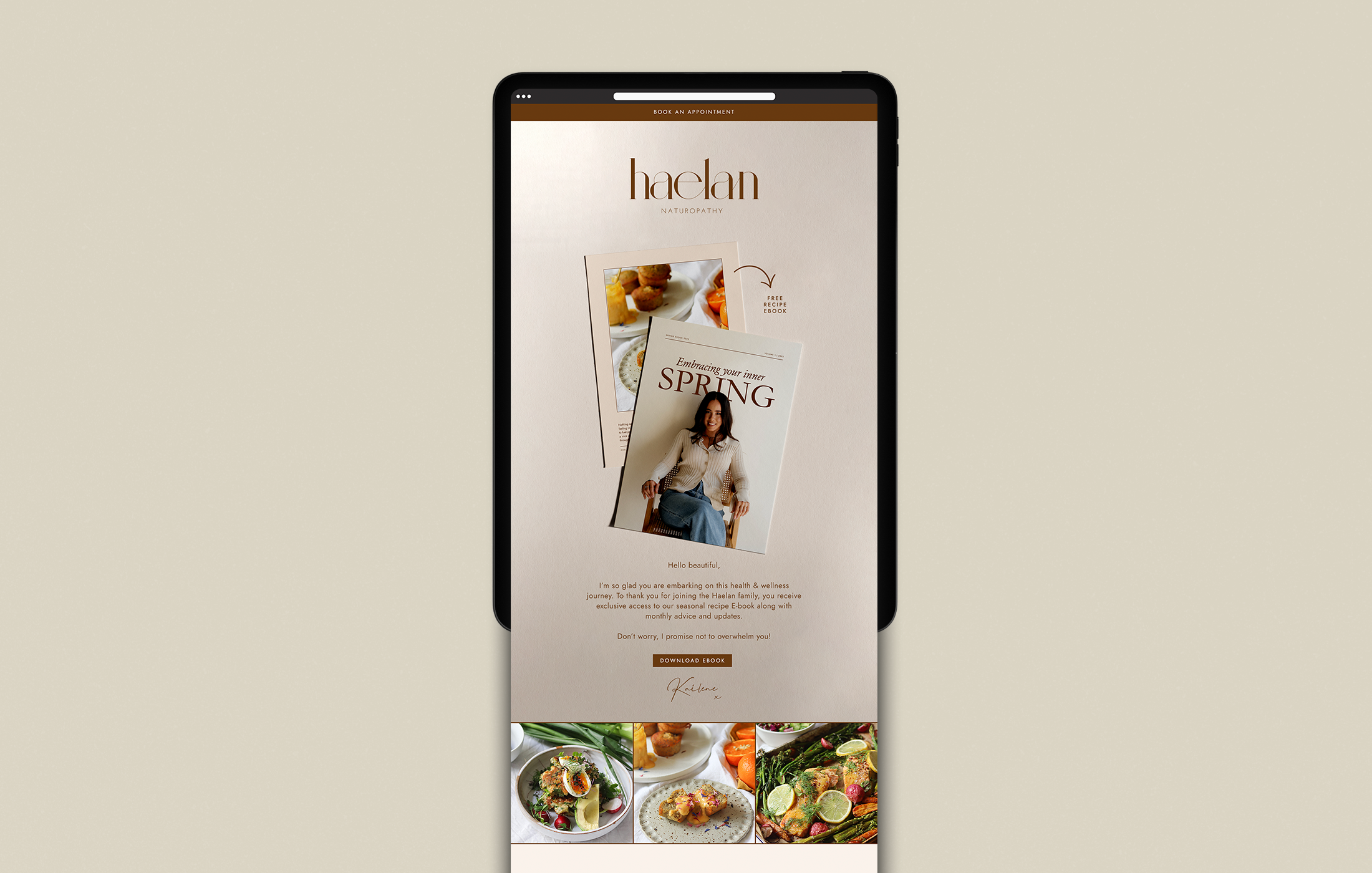
How to Make Your Brand Stand Out in a Crowded Inbox
According to Marketing Charts, your subscribers are only spending an average of 10 seconds reading your brand email — which means you only have a few moments to make an impression.
A high-quality email is assembled with components based on the goal of your email, target audience and is designed to represent your brand. An email design will often contain graphics, gifs, pictures, and more. Other times, an email design is simple and text-based. Either way, your emails need to communicate your message quickly and effectively.
But it isn’t just about immediate sales, high-quality emails can:
Build customer loyalty
Help educate your subscribers about your brand and guide them more towards additional purchases
Encourage customers to recommend you to their friends or family
You probably know first hand that as consumers, we receive an overwhelming number of marketing emails each day. With constant points of contact from brands we love, it is nowmore important than ever to make sure the emails we send are click-worthy and engaging.
So how do you cut through the noise?
The average open rate today is 31.44% - that’s the opportunity to talk directly to more than 30% of your audience with every email you send. When done well, this is a major benefit to your digital marketing. With a chance to further your relationship with your customers in every email, your visual email design is just as important as what the email says itself. Our email checklist is your guide to ensuring your email design is converting in those initial 10 seconds.
Our Email Checklist
Engaging subject line and preview text - To create intrigue or excitement. Because what good is creating an amazing email, if no one hits open
Professional logo and navigation bar - Utilise your brand recognition, including your colours and fonts, so that customers immediately know who you are.
Stand-out hero image - Use striking visuals and potentially a GIF here.
Clear headline - To capture attention and convey your brand's personality.
Short and sweet blurb - Summarise your email content using your unique tone of voice.
3-6 images plus body copy - Use striking images to support your key messaging, and keep copy relevant and concise. Be sure to link directly to your website for easy conversion.
Clear CTAs - Be direct. 1-3 is best. Our favourites include:
Shop now
Read the blog
Book an appointment
Contact us
Strong footer - Provide further actions, including:
Link to website
Social Media Link
Unsubscribe
Email Preferences
Business Address
Think your email designs could use a spruce-up? Or reckon you need to get a little smarter with your email strategy?
Get in touch to book a free 20-minute consult with Sammi today.


